It’s the question that stops people mid-order, and it’s almost impossible to answer from a product photo. Every sticker fills the frame on a screen. On an actual bike, the same design can read as a sharp finishing touch or disappear entirely — and you can’t tell which until it arrives.
So let’s answer the question behind the question. Not “how many millimetres”, but: will it look right on my bike?
Bike name sticker size: small on purpose
Bike name sticker size matters because a design that fills a product photo can look very different on a real frame. This guide shows how our discreet proportions look on a top tube, helmet and rim, so you can choose a placement that feels intentional and remains easy to read.
The first thing worth saying is that these stickers are deliberately discreet.
That’s the whole point of the look. On a pro bike, the name on the top tube is a small detail you notice once you’re close enough to admire the bike — not a decal announcing itself from across the road. Oversized lettering is what makes a bike look stickered rather than finished.
For a useful sense of scale, measure 5 mm letter height for BASIC and PRO, and 7 mm for PLUS. These dimensions refer to the letters, not the flag or the complete sticker. Contrast, the text you choose and viewing distance also affect readability.
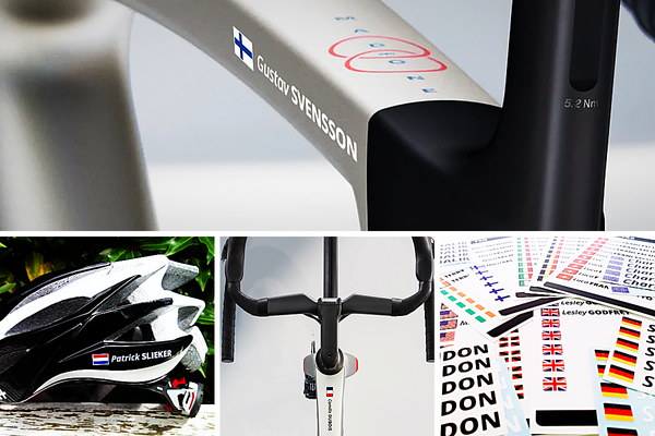
Make your bike easier to identify and give it a clean professional look.
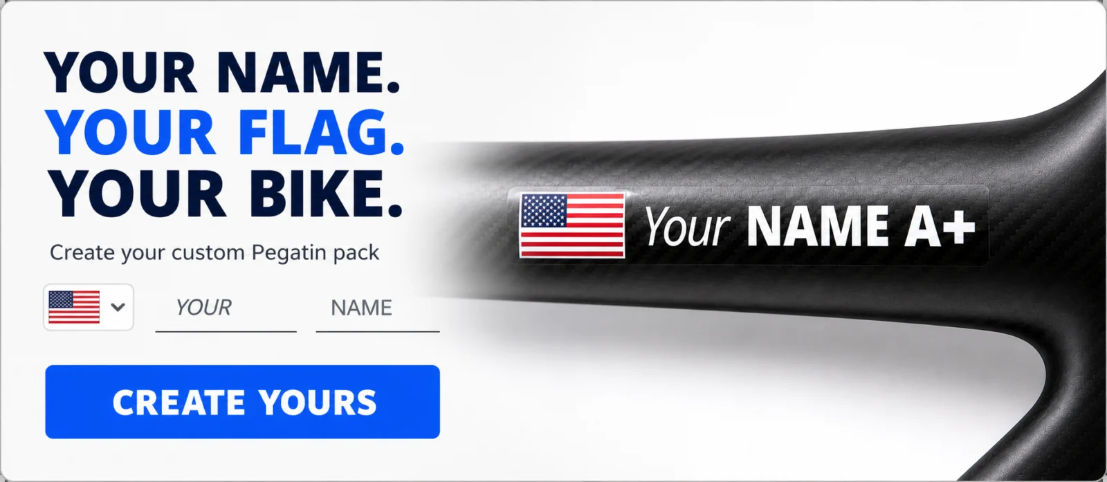
Two different looks
Where you do get a choice is between the standard proportion and the bolder one.
BASIC and PRO use the classic pro-peloton proportion, with the flag slightly taller than the lettering beside it. It’s understated and it’s the look most riders picture when they imagine a name on a top tube.
PLUS uses individually cut 7 mm letters, compared with 5 mm for BASIC and PRO: 40% taller. The overall width and flag proportions depend on the design. Greater letter height does not guarantee recognition at a particular distance.
Choose PLUS if you prefer taller lettering and no surrounding film. Choose BASIC or PRO for the smaller 5 mm letter height, considering the surface colour. No measured recognition advantage among other bicycles is claimed.
Both are correct. They’re just answering different questions.
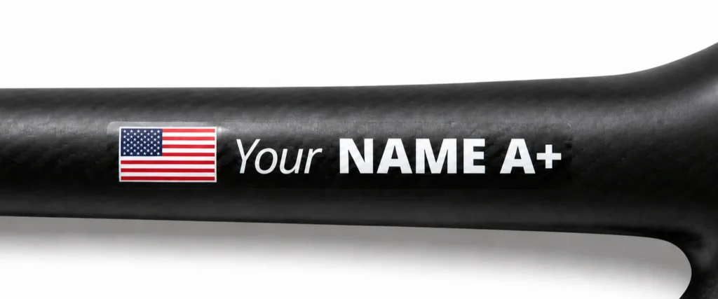
Width matters as well as height
Check the uninterrupted surface and the width of your chosen design to decide whether a sticker suits that position.
The height is fixed. The width depends on your name.
The width depends on the characters and chosen text, not just the number of letters. A short name often needs less space than a long surname. Measure the uninterrupted surface and check the current design dimensions before ordering.
So the question isn’t really “is the sticker too big?” — it’s “does this surface give me enough uninterrupted length?”
If you’re working with a long name, our guide on what to put on your sticker covers how riders handle it: splitting across the two fields, using a surname alone, or going with the nickname everyone actually uses anyway.
Where it fits
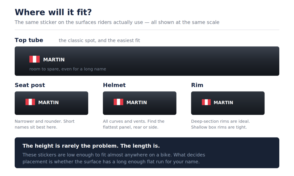
Top tube — a common position. Check the uninterrupted length, cables, joints and bags before choosing it; a long name may not fit every frame.
Seat post — can offer an alternative on a suitable smooth section. Avoid clamps, adjustment markings and areas reserved for race identification; curvature can reduce readability.
Helmet — follow the helmet manufacturer’s advice. Use only an approved smooth, non-critical area; never cover vents, certification labels or protective systems.
Rim — check the wheel manufacturer’s instructions. Never cover braking surfaces, valves, inspection areas or required labels. Not every rim is suitable for an adhesive decal.
Fork legs, stem, bottle cage — assess each part separately and follow its manufacturer’s instructions. Do not cover clamps, interfaces, moving areas or required markings.
For spots that look tempting but cause trouble later, see our guide on where not to put a bike sticker.
A paper placement test
A paper mock-up can help you assess placement before ordering, but it is not a guarantee of fit or readability:
- Write your chosen name on paper with 5 mm or 7 mm letter height. Compare it with the current design dimensions rather than assuming a handwritten sample is exact.
- Hold it against the spot you have in mind.
- Step back a few paces and look at the whole bike.
Compare the smaller and larger lettering, the contrast and the available surface. A shorter version of your name may fit better; check the actual design dimensions before ordering.
Frequently asked questions
Are all 10 stickers in a pack the same size? Yes. Every sticker in a pack is identical in size and design. What varies in PRO and PLUS is the lettering colour — 5 white and 5 black.
Will a long name look cramped? Not cramped, just longer. The letters stay the same height; the sticker simply extends further along the tube. Worth checking you have enough flat surface for it.
Is PLUS bigger overall? PLUS has 7 mm letter height rather than 5 mm, and individually cut letters without surrounding film. The complete size depends on the chosen name and design; do not treat letter height as the complete sticker size.
Can I order a different size? The proportions above are what we produce. If you have an unusual application in mind, email hello@pegatin.com and we’ll tell you honestly whether it’s something we can do.
How thick is the sticker? Construction differs by pack: BASIC and PRO use printed film, while PLUS uses individually cut letters. Check current product specifications for thickness; a universal edge-free claim is not made. Read our guide to sticker durability and care.
Where can I see the exact dimensions? They’re listed on the product page in the configurator, alongside each pack.
The short version
These stickers are small by design, because that’s what makes them look like part of the bike rather than something stuck on it.
Choose BASIC or PRO for 5 mm letter height, or PLUS for 7 mm individually cut letters. Check both height and width, surface colour, manufacturer instructions and uninterrupted space before ordering.
Create your personalised bike name and flag stickers — use code PRODECALS for 15% off
Order well in advance: production and delivery take time. Check the current estimate for your destination.